
Overview
- Four Week Design Sprint: Sept. 28 – Oct. 23 2020
- Deliverables: Three high-fidelity concepts for clock faces narrowed down from 10 low-fidelity concepts.
- Tools: Adobe Illustrator, Photoshop, and Figma.
Five students from CSUMB were selected for a Fitbit design contract to design digital clock faces for Fitbit products. We were given freedom to design for our own target audience. The designs shown here are not final products.
Ideation and Sketching
I first sketched out 10 concepts. Some sketches have alternative options or different states such as designing for the Always-On-Display mode. Different concepts could focus on different purposes the user might want. Some might be focused on style why others might be interested in a certain UI stat to be easily readable.
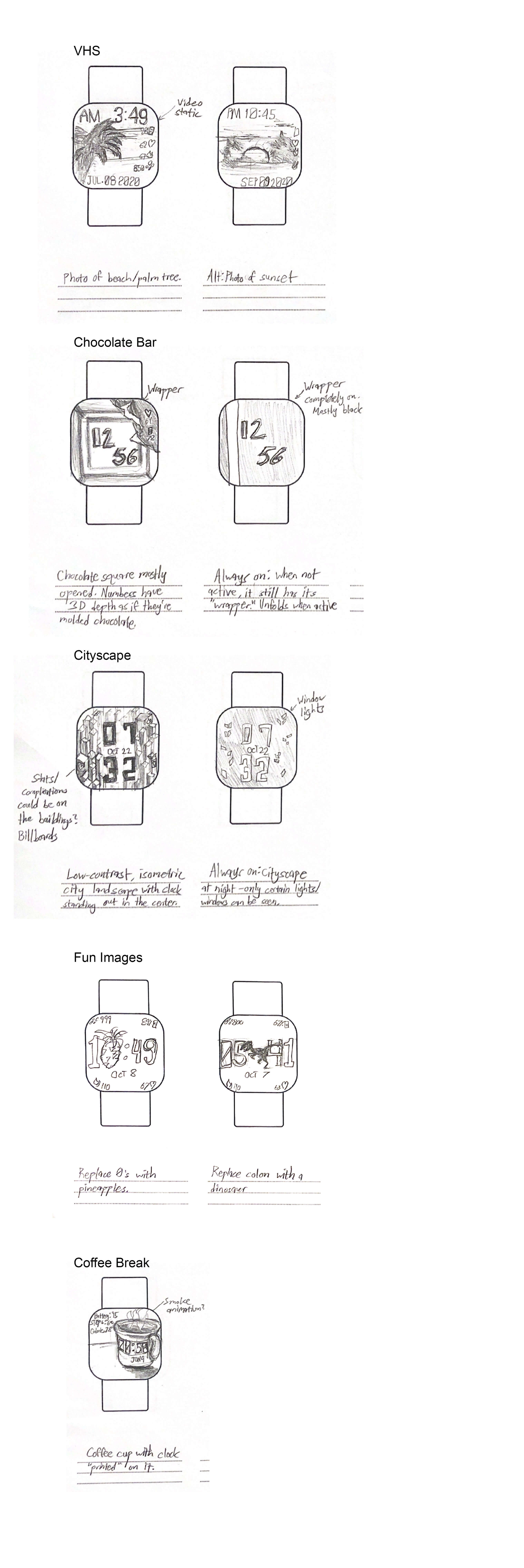
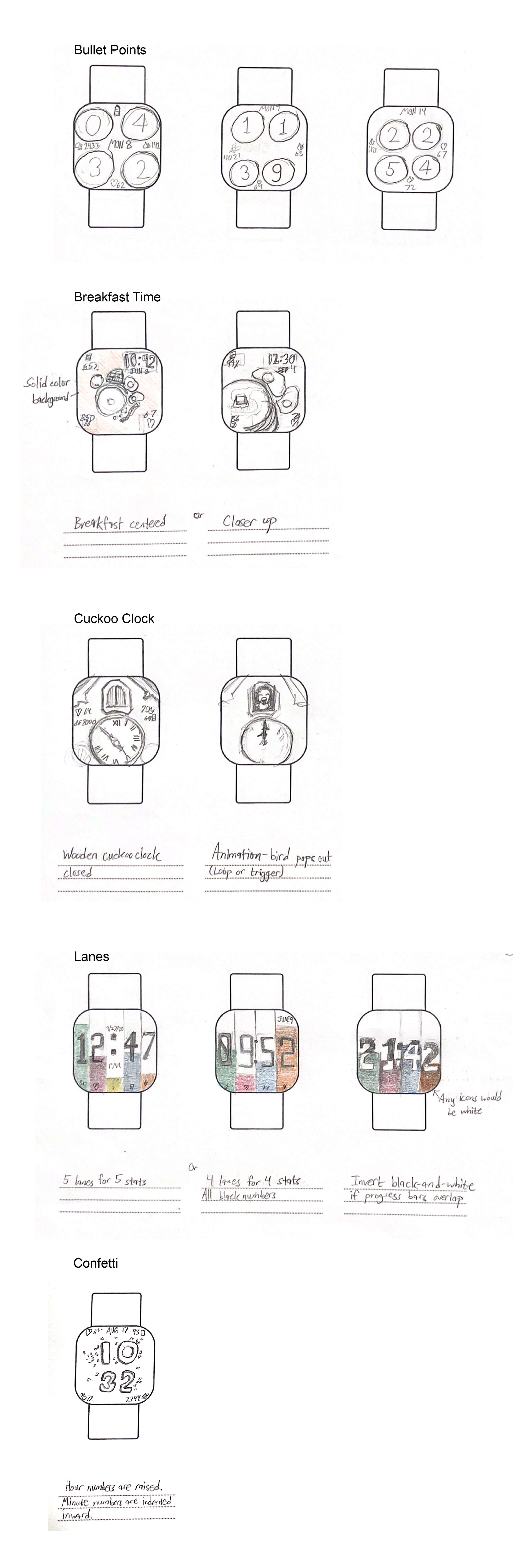
I tried to design concepts that might appeal to people around my age. I also wanted a variety of options. Some are focused on functional UI. Some might tell a story with the visuals while others would convey humor out of randomness. After a design review, the next iteration would be narrowed down to six concepts.
Iterating
The six remaining concepts would be then rendered at a higher fidelity.

I received more feedback from Fitbit designers and peers at the next design review about how to best implement Fitbit features and UI in addition to visual clarity and concept refinement.
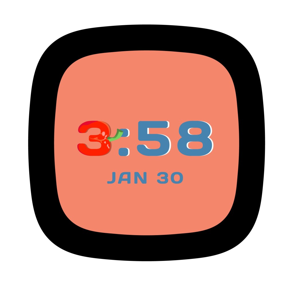
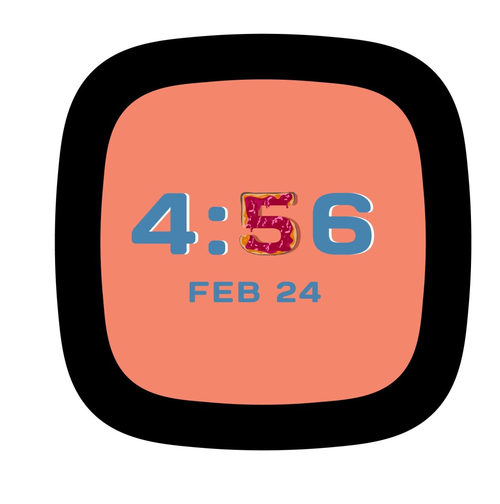
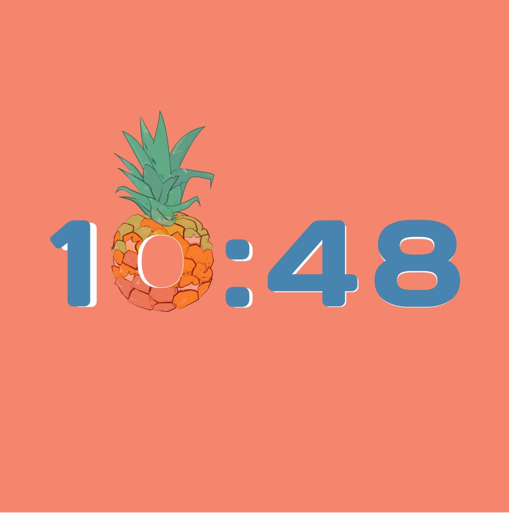
The Fun Images concept originally involved a few illustrations of various things, such as a dinosaur. But we narrowed down the theme to food items that would replace one clock number every minute. I knew this change would increase the amount of illustrating I’d have to do, so I simplified the art style of the pineapple I had so I could realistically produce 10 consistent food illustrations in such a short time.
Confetti, Chocolate Bar, and Fun Images would be the final 3 concepts to move on to the next round.
High-Fidelity Concepts
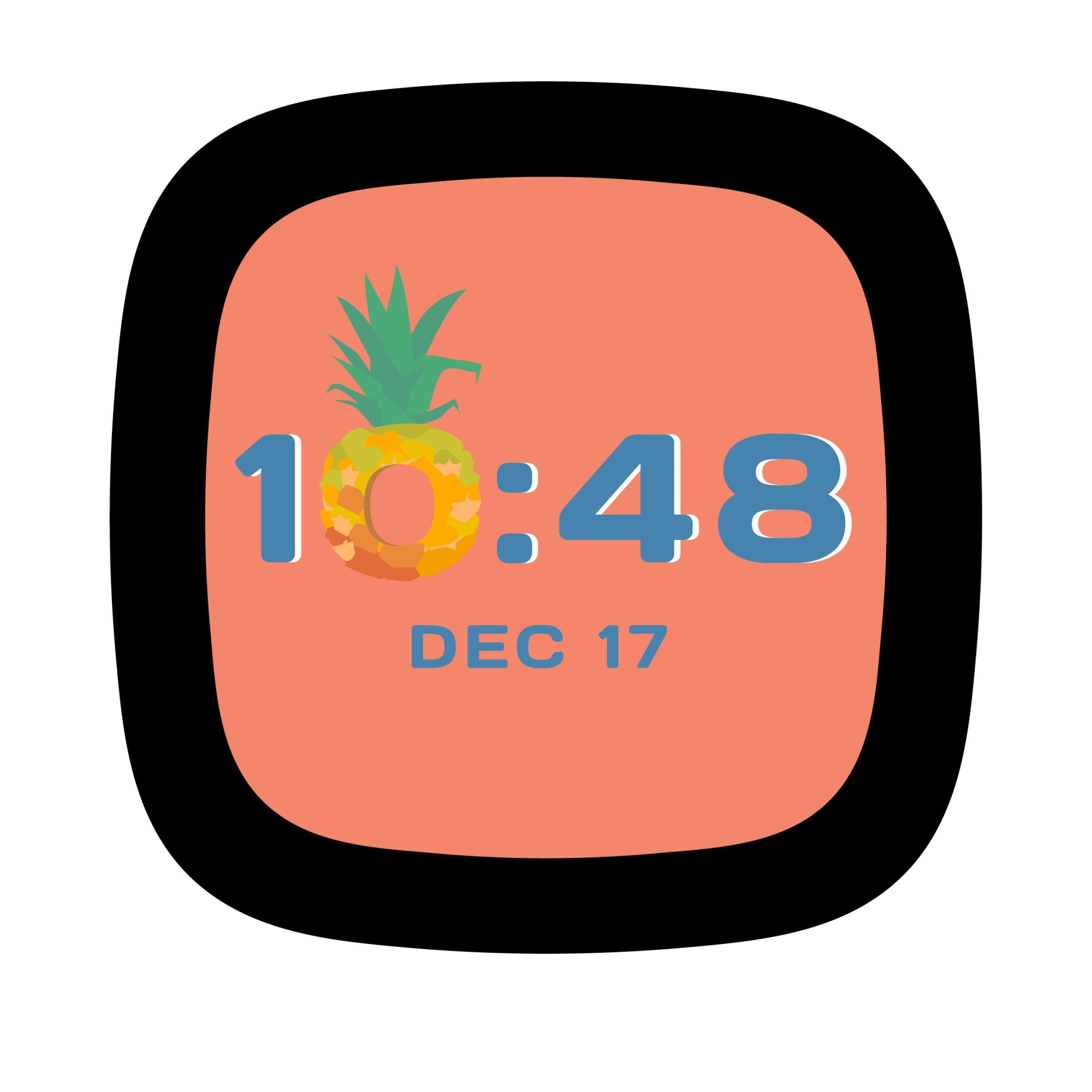
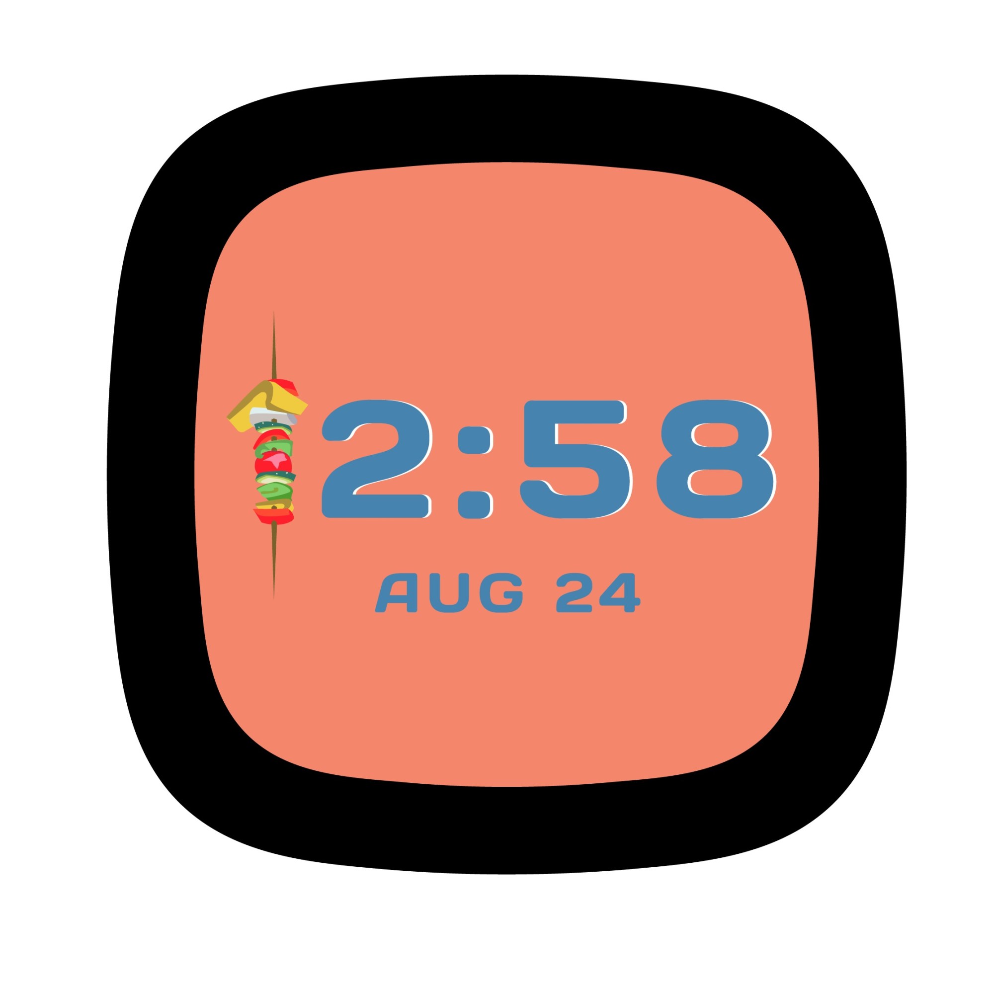
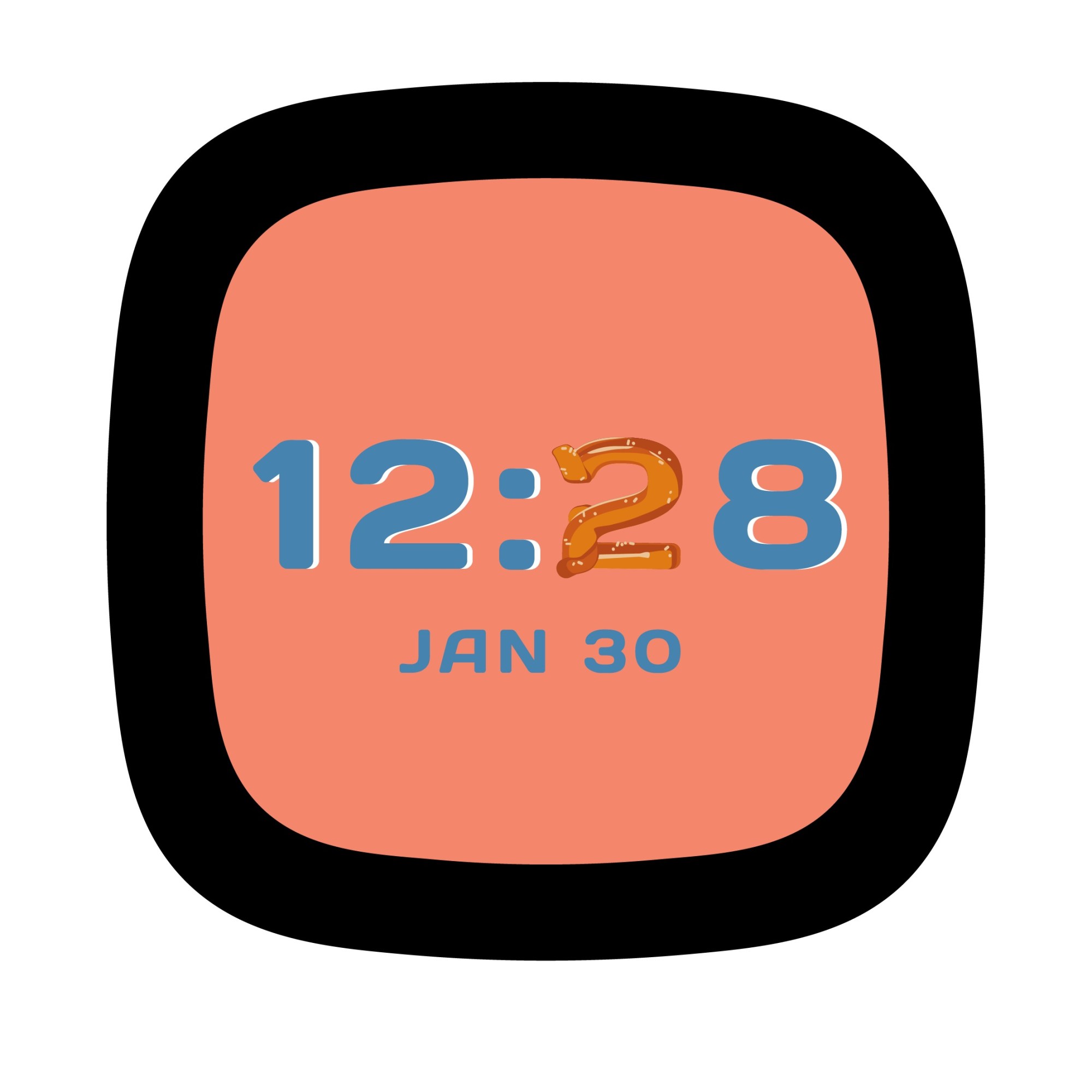
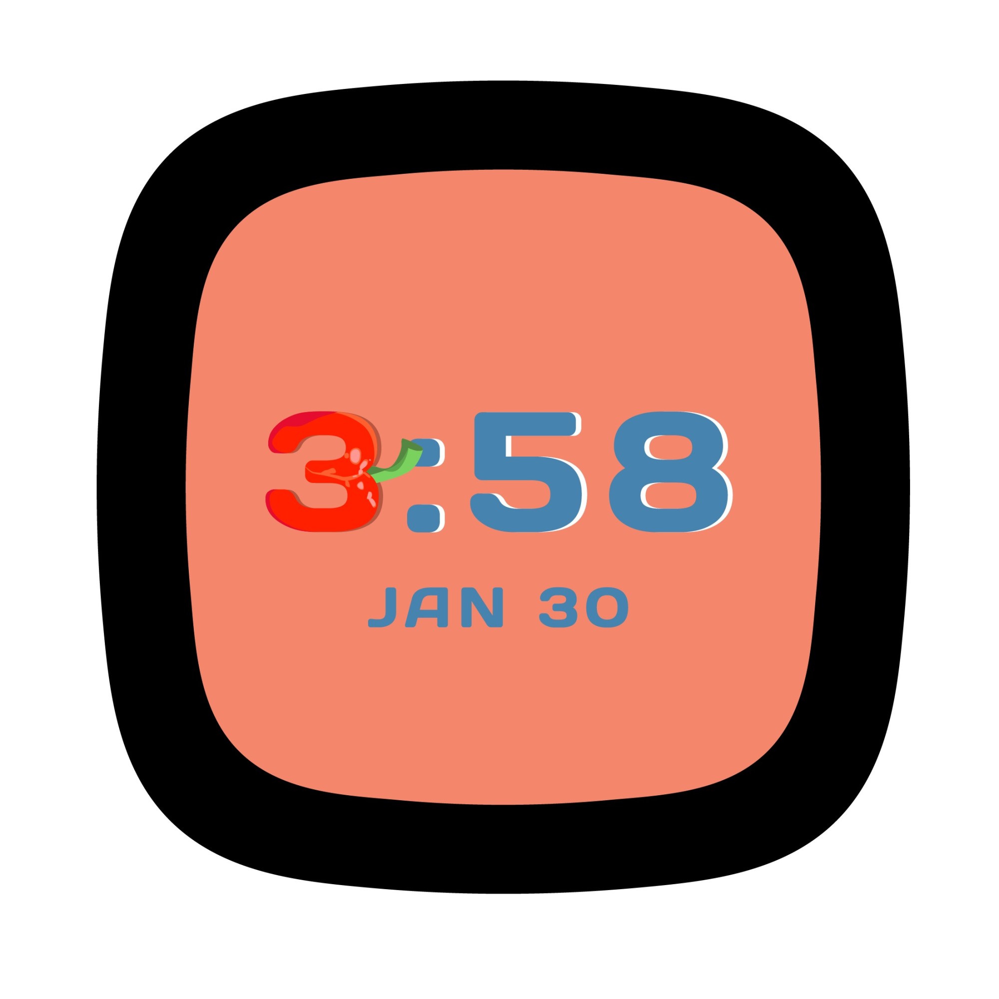
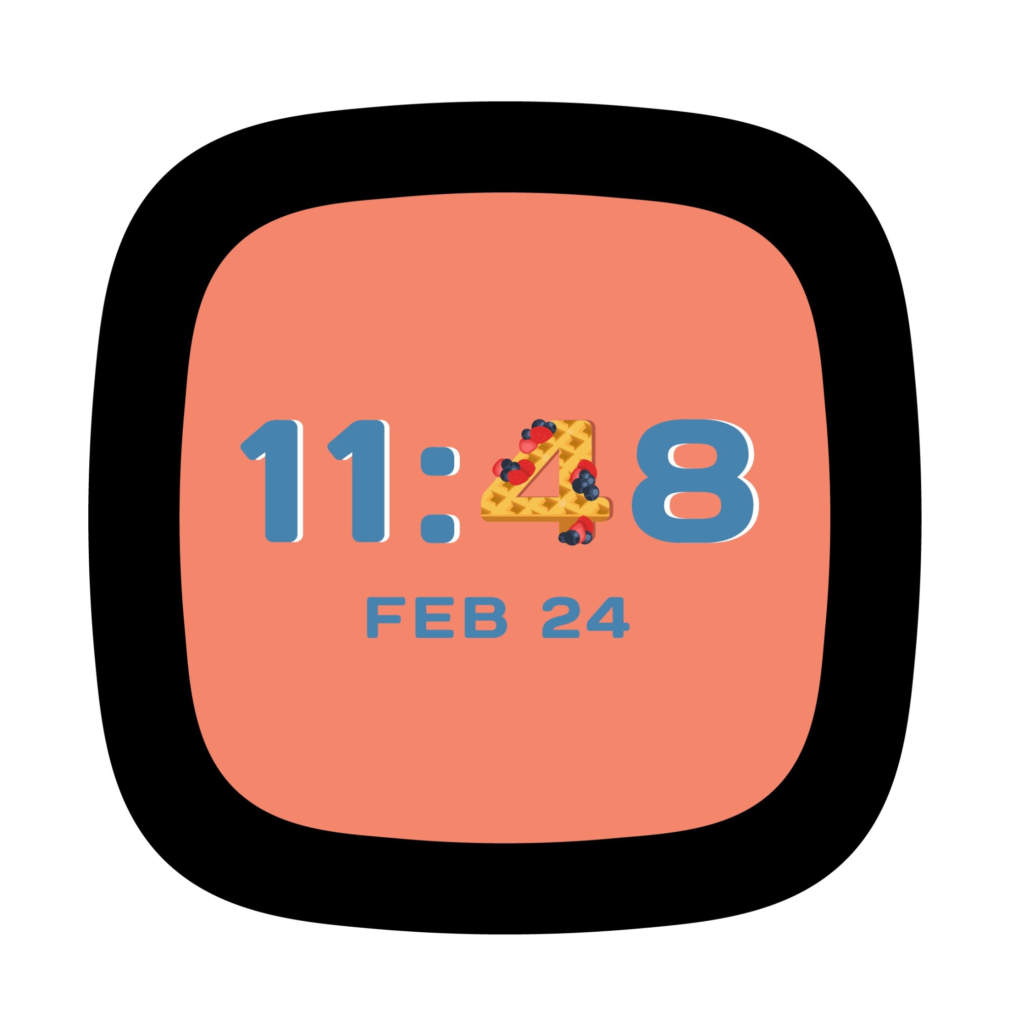
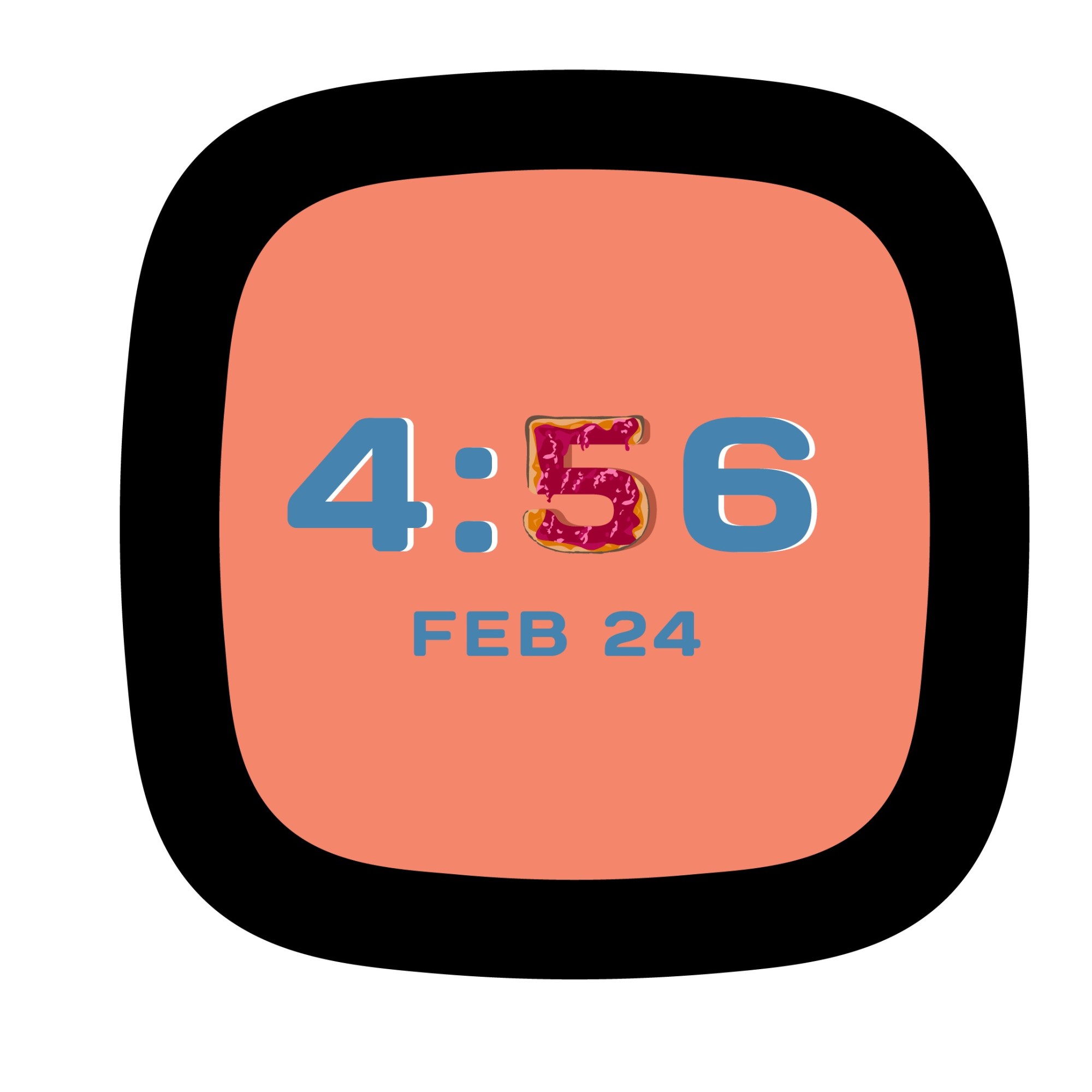
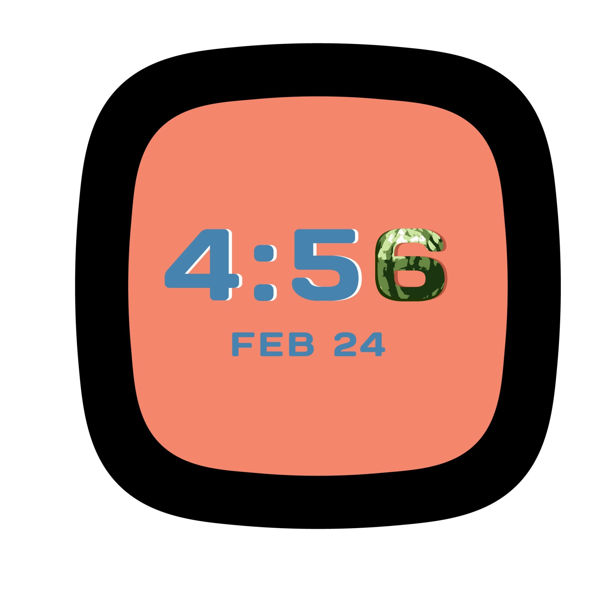
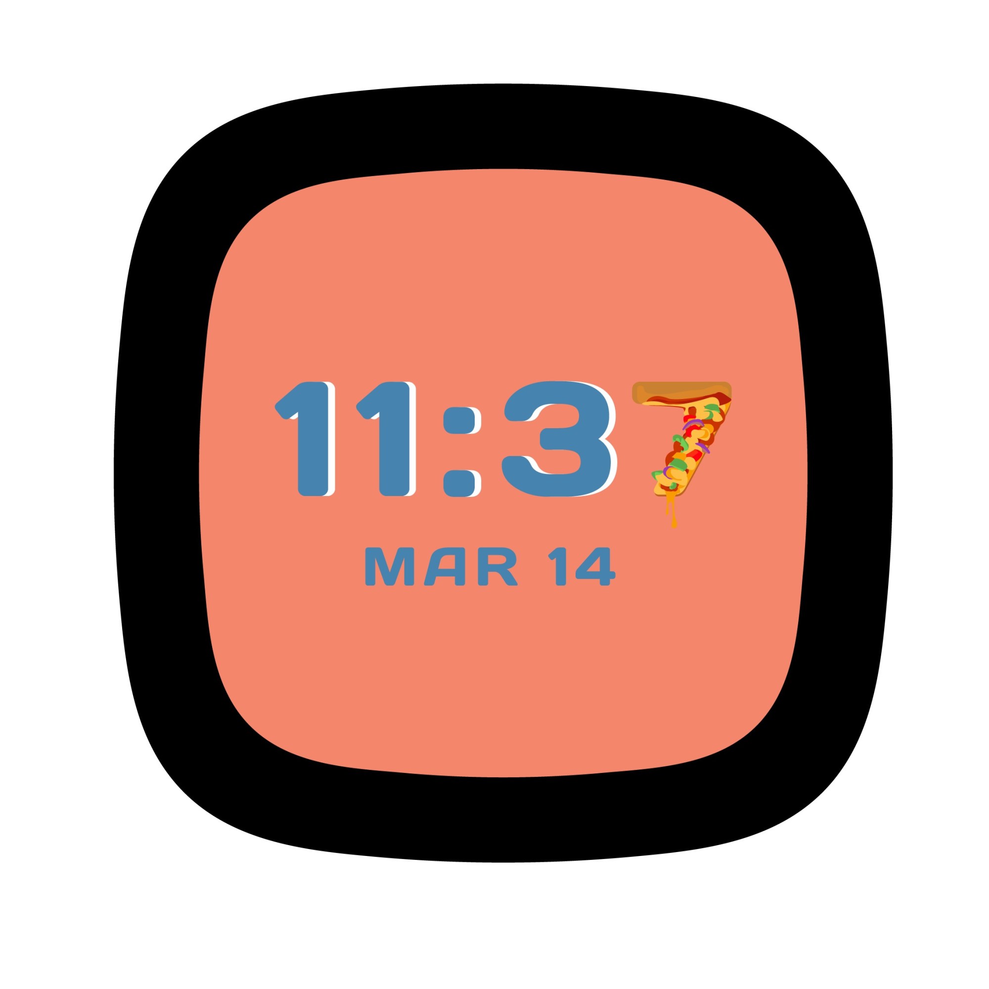
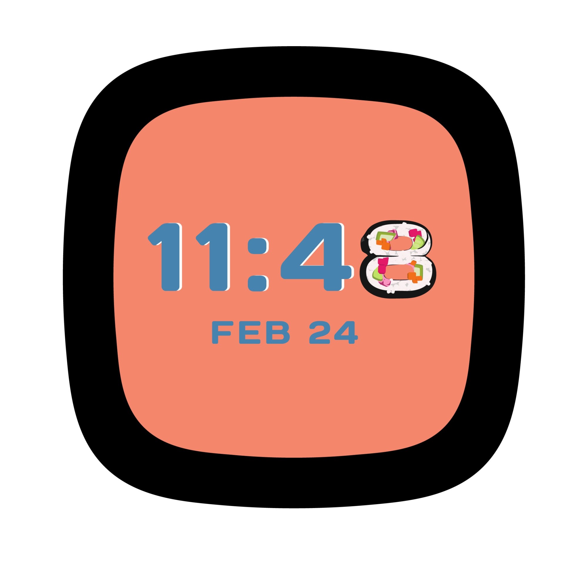
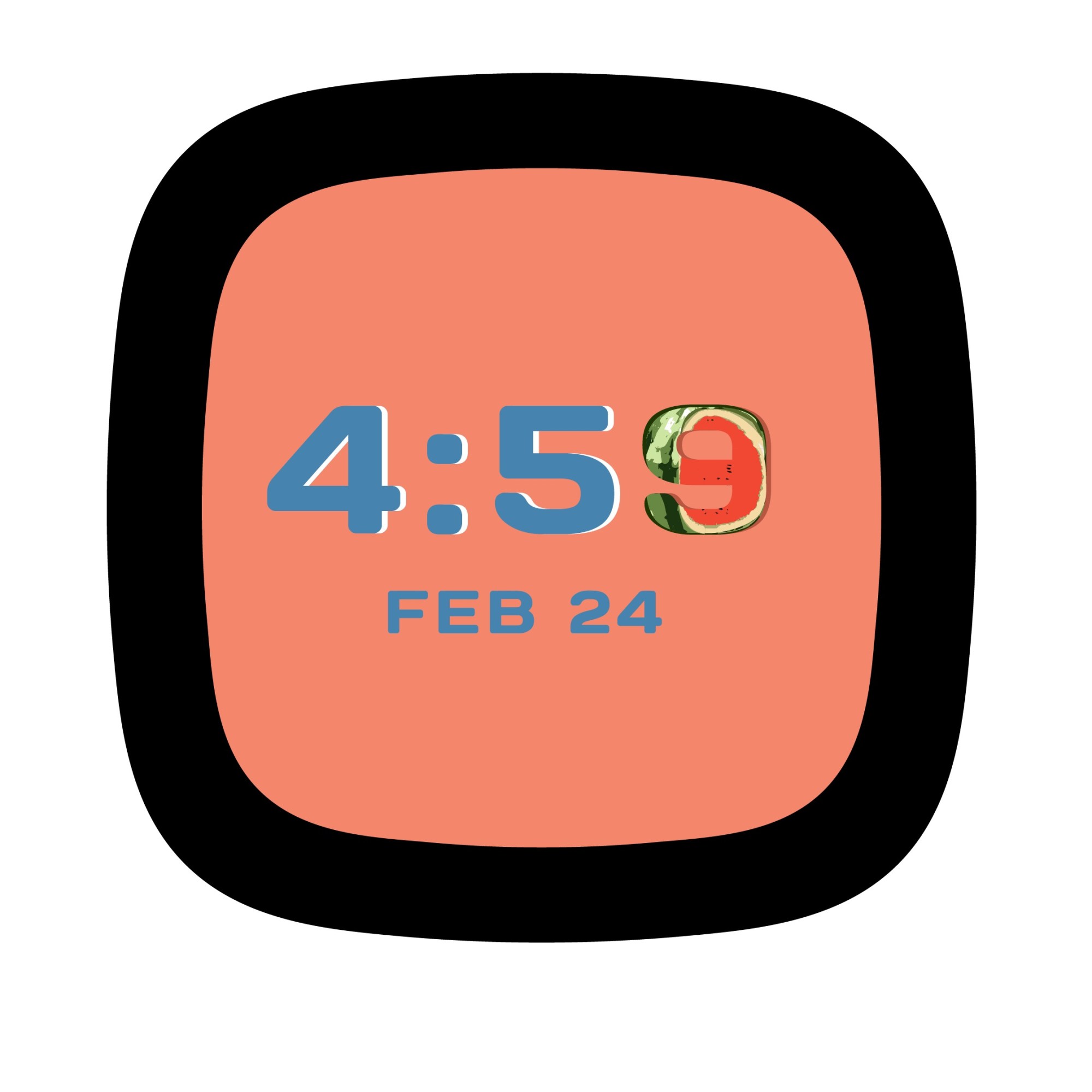
I illustrated quickly to make sure the Fun (Food) Images concept would have 10 food items swapping out the number characters.
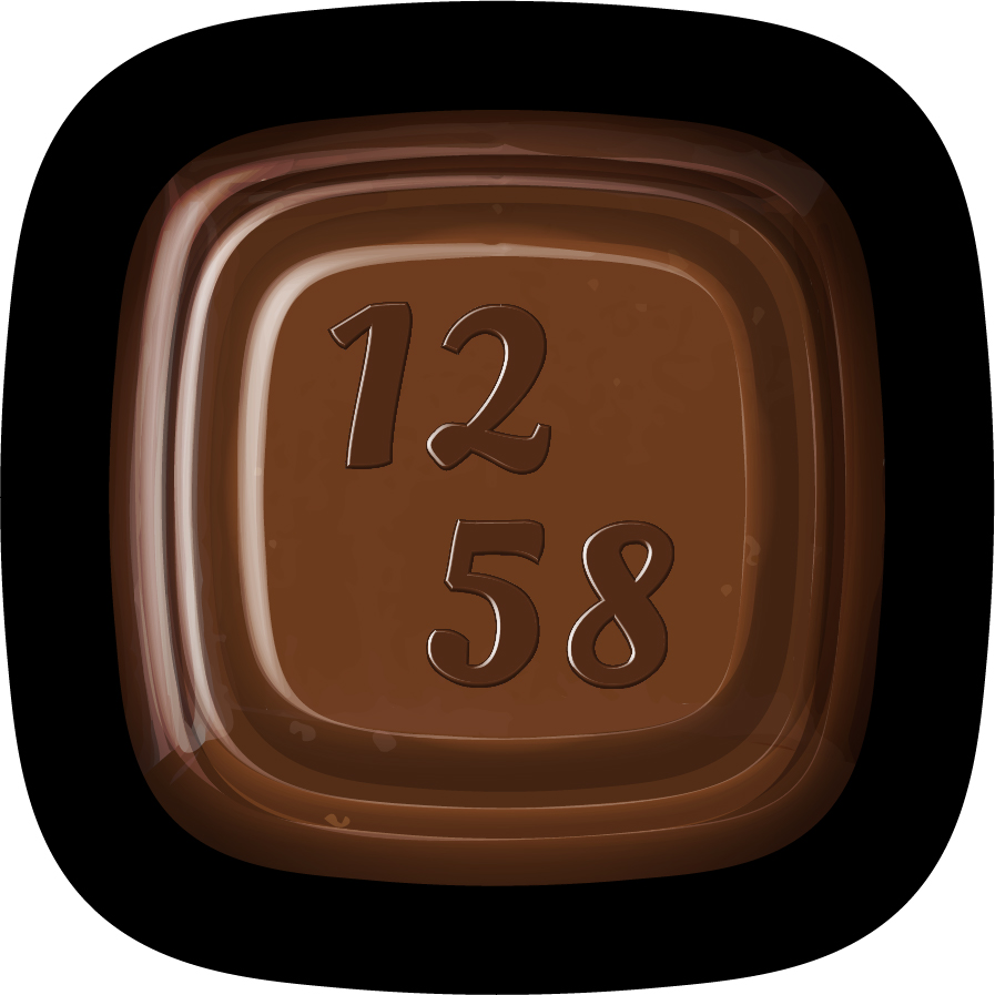
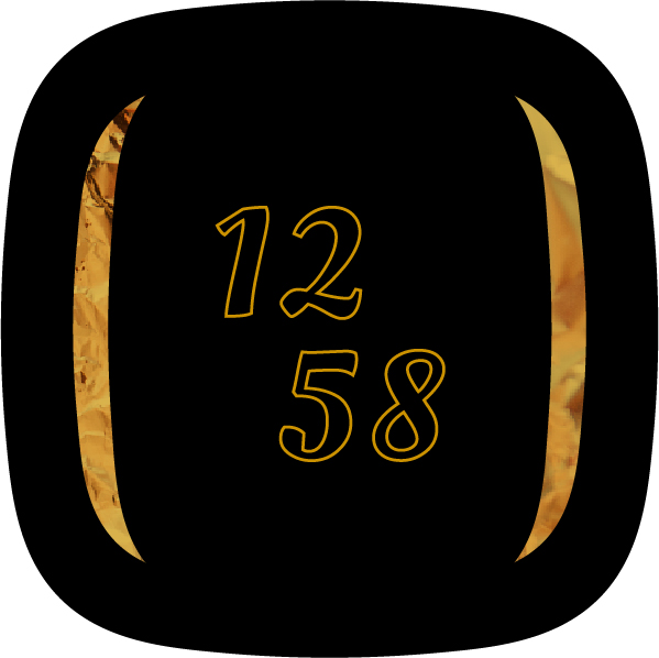
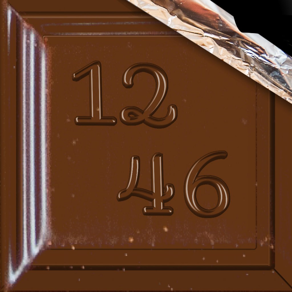
I went with a more stylized rendering for this iteration of the Chocolate Bar clock face. For the typography, I tried to find a nice middle ground between legibility and concept clarity. In addition, I made an Always-On-Display mode version that intended to look like the wrapping of the chocolate bar for when the user wants to check the time without turning the screen completely on.
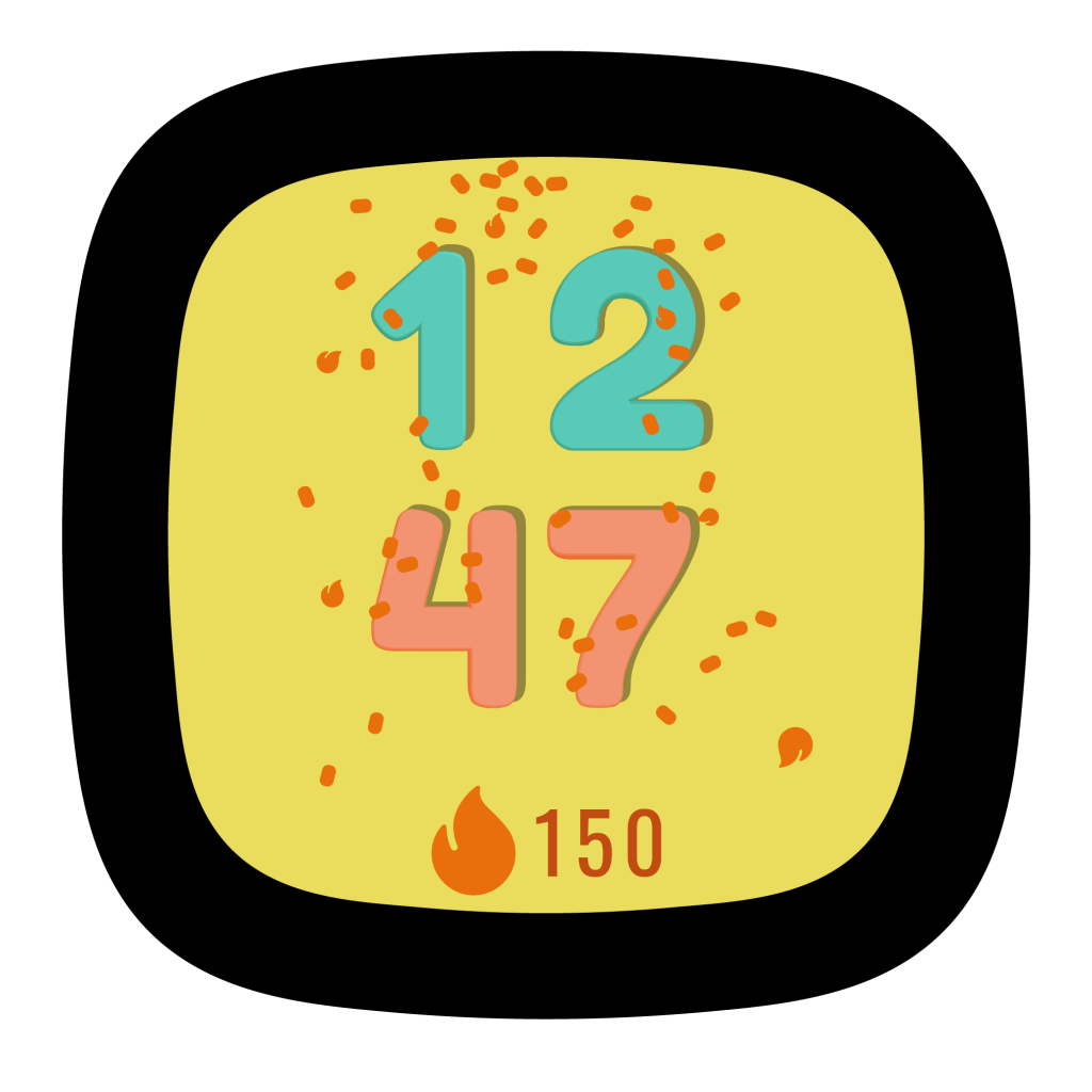
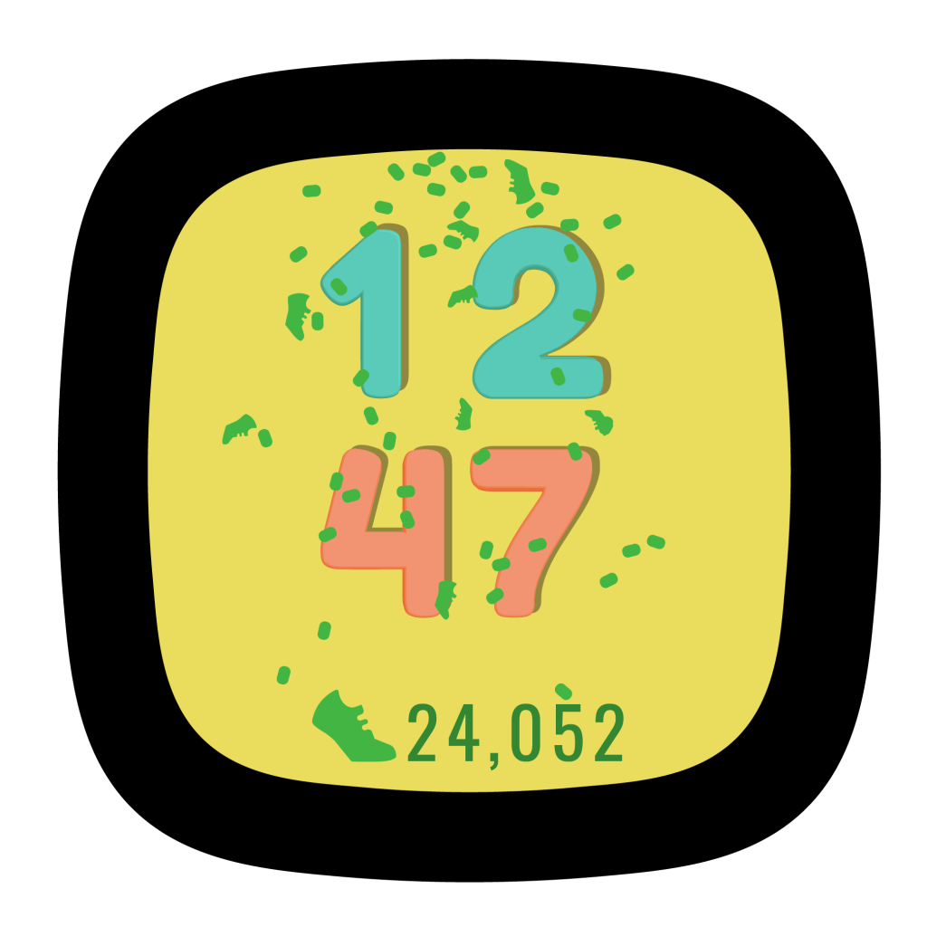
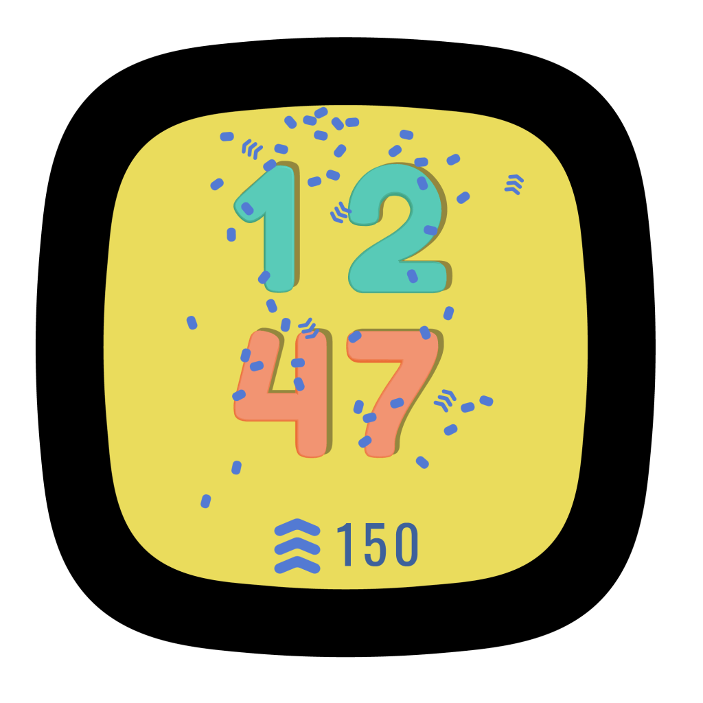
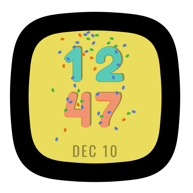
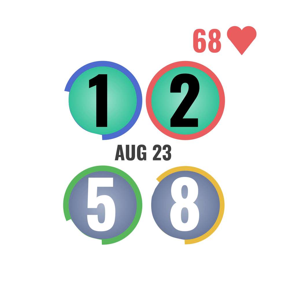
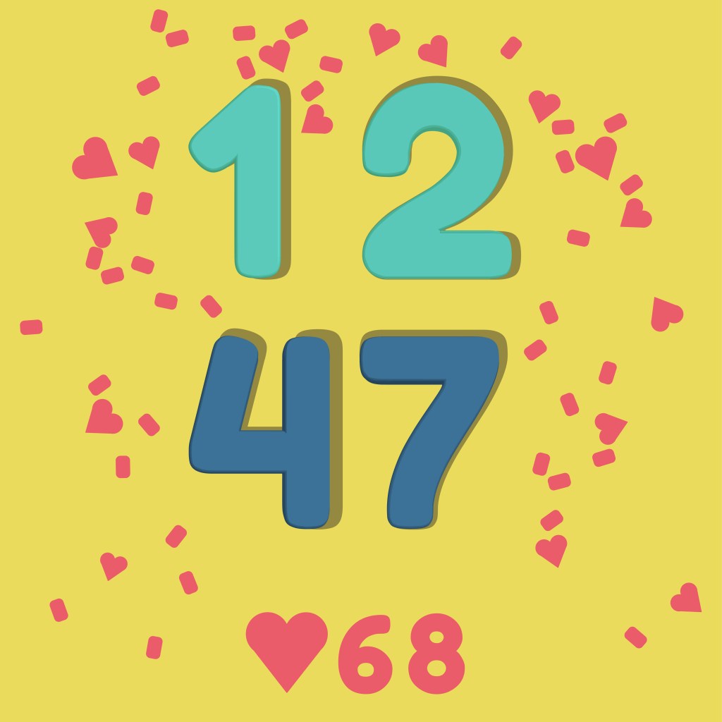
The Confetti theme concept had four versions with different icons and colors depending on what information the user wanted to prioritize.
Reflection
This was a great experience and I learned a lot from the iterative process, the design reviews, and office hour feedback. It was great to learn the best practices for designing visuals and UI for such small screens.
My goal was to design concepts that were joyous and the process of designing them was very enjoyable. And it made me very hungry.
