The Problem
College students are stressed and often overwhelmed, especially during the Fall of 2020 when spending much of their time in Zoom meetings. Students rarely have time for a break.
The Team
I collaborated with fellow students Aya Cabero and Jeremy Sommer for this project. Together, the three of us researched college students, brainstormed ideas, wireframed, and prototyped this concept.
Research and Competition
Our survey and interviews showed how stressed out college students were that they could not find a break to relax. We knew our design would have to take this lack of time for self-care activities into account. We also found that some creative activities were useful in taking one’s mind off of stressful situations.
We looked at and tested a variety of self-care apps. Some focused on habit building. Some focused on journaling users’ moods and feelings and offering a calendar to keep track of their emotional history. Some use game mechanics or personalization to engage the user. While many of these features are potentially useful as a self-care tool, I felt that many of these apps felt oddly rigid and mechanical in their approach to user experience for apps that are about feelings and emotions.
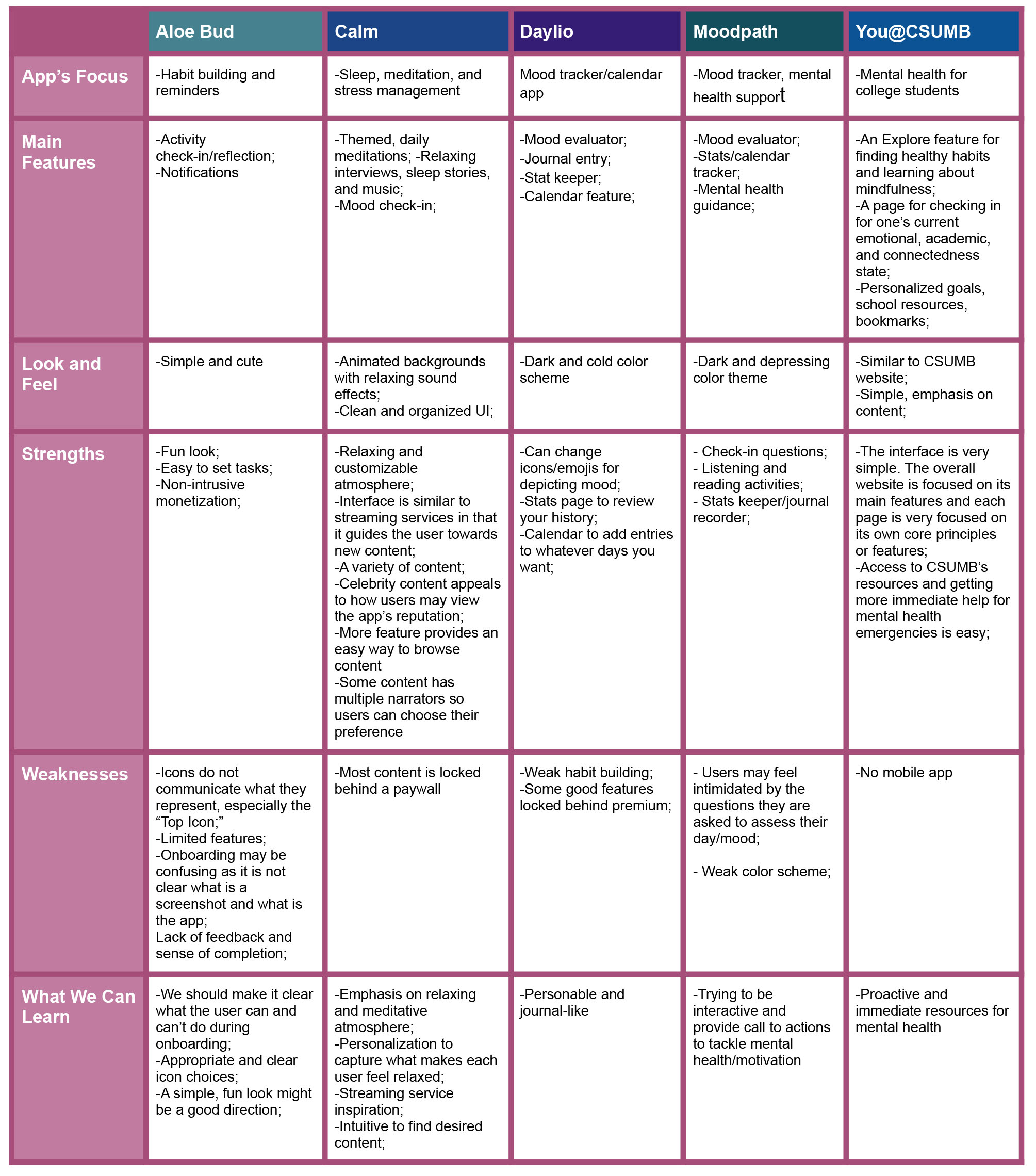
Some of the most interesting and successful apps we looked at took more care in crafting an experience that immersed the user in a relaxing environment. Some apps used ambient sounds to relax the user. One app, Fabulous, used narrative to help immerse the user in their journey, but during testing we found that it could be so abstract in its user flows as to hurt the overall usability of the experience. Another app, #SelfCare, focused less on traditional progression and more on designing a relaxing, safe space where users could get away from their stress.
I knew that for a truly unique and immersive experience that would engage the feelings of users, we would have to think outside of the box. How could we find a new take on standard features like points, achievements, and mood calendars? And how could our version improve on these features? These were important questions to me as we looked for possible solutions.
Our Solution
An art app for mobile and tablet devices that gives students a place to relax, to express themselves, to learn more about themselves, and to learn new creative techniques.
Colour Journal would focus on coloring, but would also offer simple drawing tools to keep content limitless. An ever expanding canvas would also increase the possibilities. The app would be creative, but casual. Several iterations of the prototype were made.
Personas
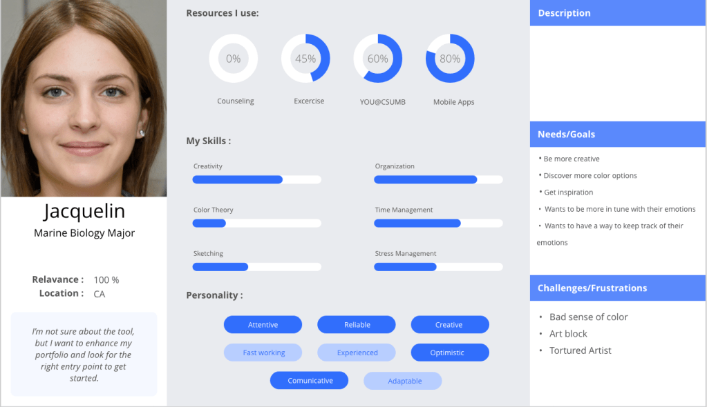
Jacquelin would be our primary persona. She is a creative student, but she is not a serious artist. Our app is designed to be casual and easy to jump into. Jacquelin doesn’t have very much time for self-care activities. She’s also looking to be more in tune with her emotions.
As the primary persona, she would focus more on the coloring features of the app.
We also wanted personas to represent the drawing side of the product as Colour Journal could be a good way to freely and loosely get ideas down and express oneself.
Carter would be our secondary persona. He would be more used to advanced art software so he would not be our target audience, but there would still be value in the app for him.
Branding and Moodboards
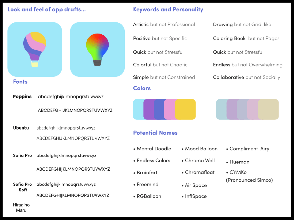

We focused on finding a friendly, welcoming design. One direction was more sleek and minimal. This would keep the attention on the art. The other direction would be more warm and natural to keep users relaxed. We ended up going with a simple design with a color scheme that adapts to the users’ input so they can be better immersed in the experience.
We also took inspiration from the more artistic features of Animal Crossing, a very successful video game about decorating a virtual space that has become popular as a relaxing break from the stress of these times. I knew we would want to accomplish similar goals as this game and its proven formula.
The Layout
Ensuring that the user would not be spending too much time trying to navigate around the app was something that I felt was important. We ended up with three main pages: the Canvas, Home, and User pages as seen represented on the navigation bar below. We wanted to make sure that any information fit simply in these three pages. The Canvas is designed for creative expression and reflection. The Home is meant for adding content to the Canvas. And the User page would be for settings and number-based stats.

| Canvas | Home | User |
|---|---|---|
| The expanding art canvas | Search | User settings |
| Color palettes | Doodle Browser | Number-based stats |
| Mood/color history | Activities | Account Settings |
| Prompt/Doodle randomizers | ||
| Trophies |
The User’s Journey Through Colour Journal
Colour Journal will take the user through a few main steps to engage them and improve their mood.
- Journal mood
- Find and add content to the canvas or draw your own
- Color
- Reflect
…And repeat
Our user, Jacquelin, is feeling stressed and only has less than 15 minutes for her break. She wants to kick back and do some meditative coloring on her iPad to take her mind off things.
First, she’ll journal her current emotions and choose associated colors for this session.

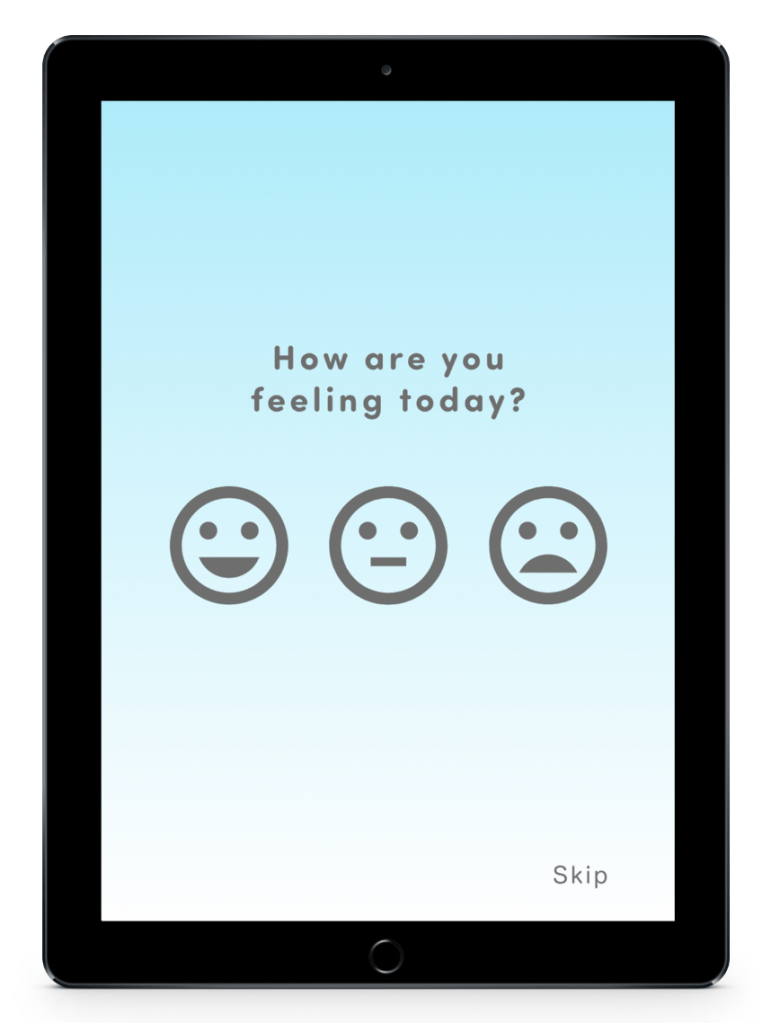
She sees the startup loading screen before being prompted to choose how she’s feeling for this session. This mood will be tracked in addition to narrowing down the choices for her next option.
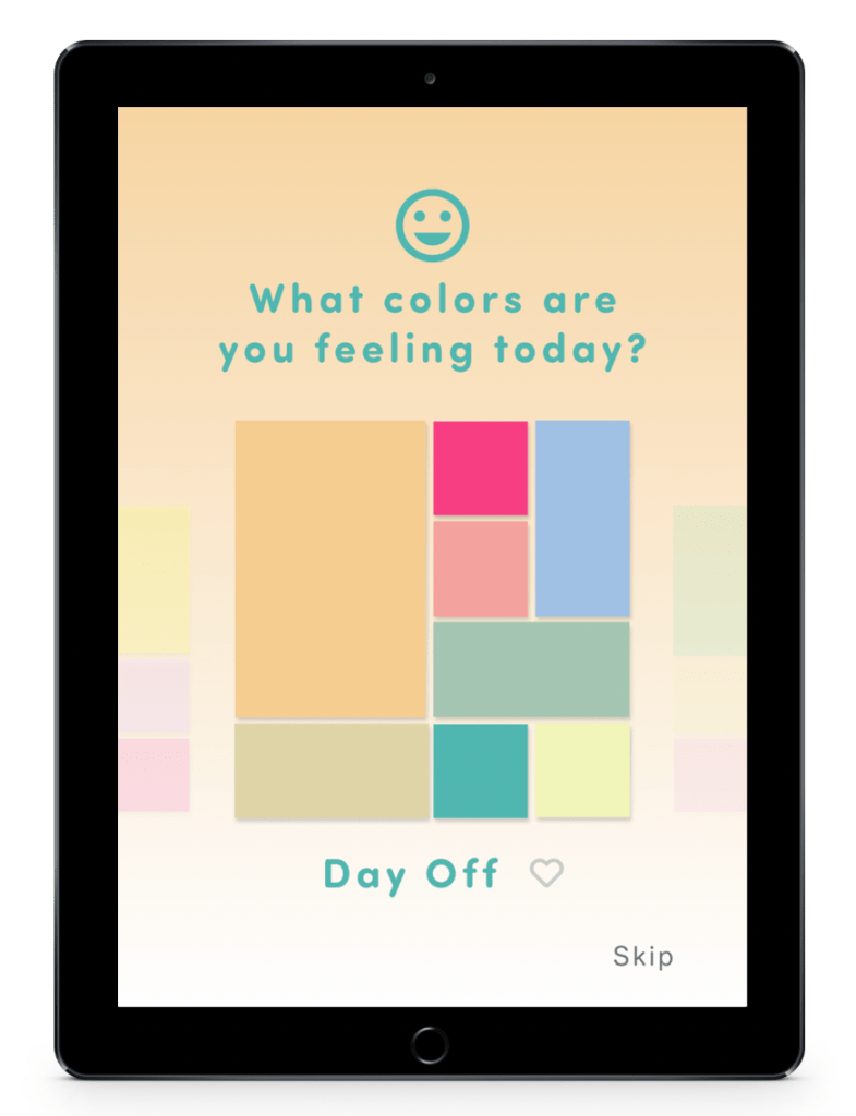
That choice will affect which color palettes Jacquelin will be swiping through for this session’s color palette. The chosen palette will be the first color scheme that comes up for Jacquelin and will also affect the color scheme of the user interface. She can also heart color palettes that interest her to save them for later in her palette selection screen.
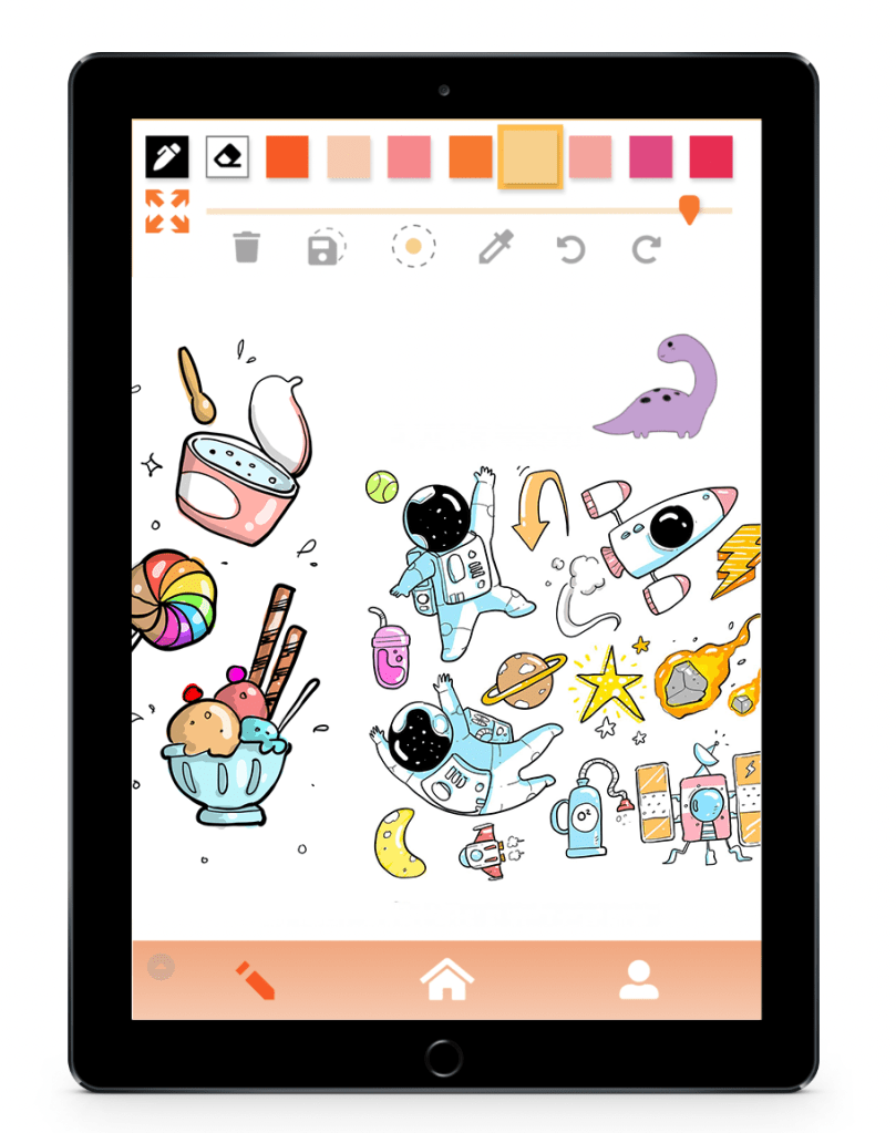
Jacquelin can begin coloring in her canvas, but she’s not feeling confident in her drawing skills right now, nor does she have time at the moment. She wants new content to color quickly. Luckily, there is always plenty to find in Colour Journal.
Jacquelin will now browse through the library for new doodles to add to her canvas.
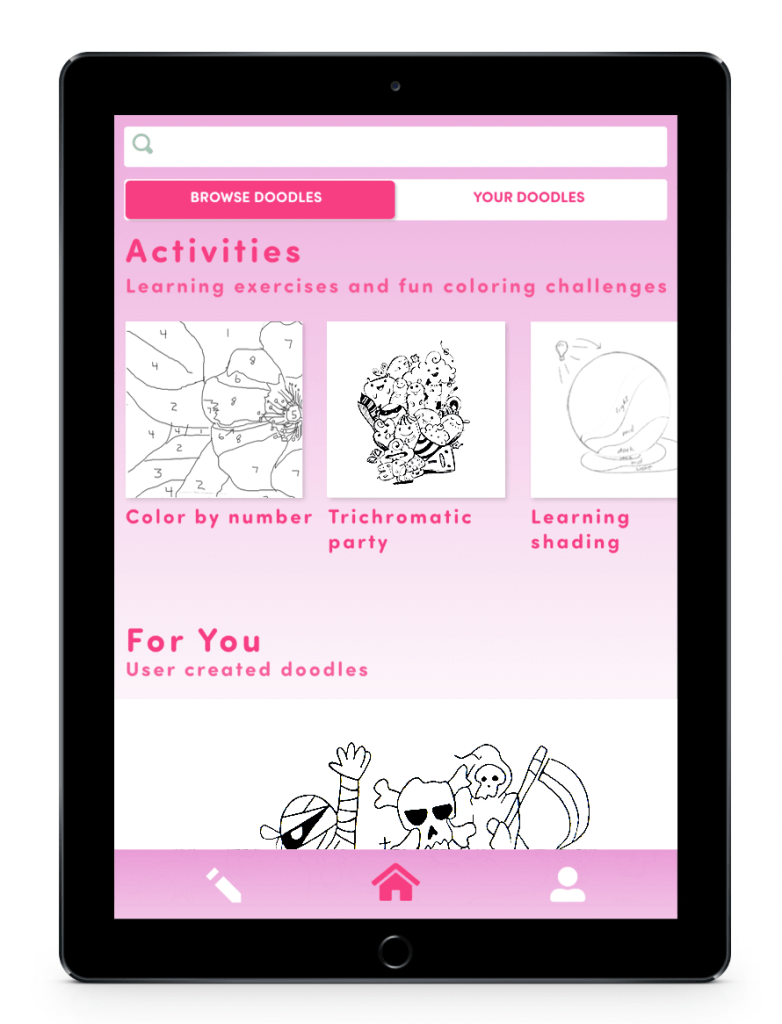
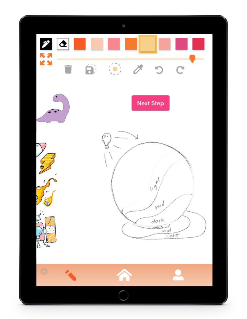
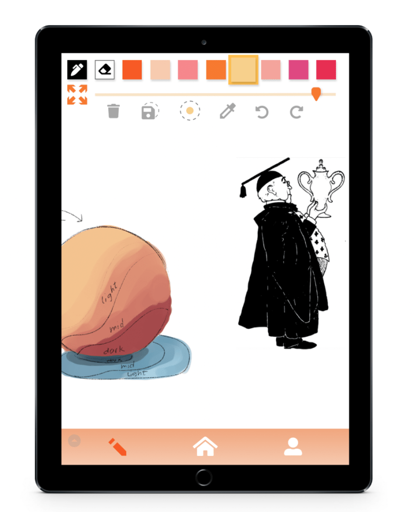
After tapping the home icon, Jacquelin sees the main page for browsing and adding new doodles to the canvas. She could start browsing user created doodles to add, but she sees an activity doodle that interests her. Jacquelin taps the “Learning shading” activity and a new doodle is added.
She can now start coloring the content.
These activity doodles can have special conditions, such as their own color palettes to use or, in this case, a “Next Step” button. Completing these steps will help Jacquelin learn new creative techniques.
The added content simply expands Jacquelin’s canvas horizontally to the right.
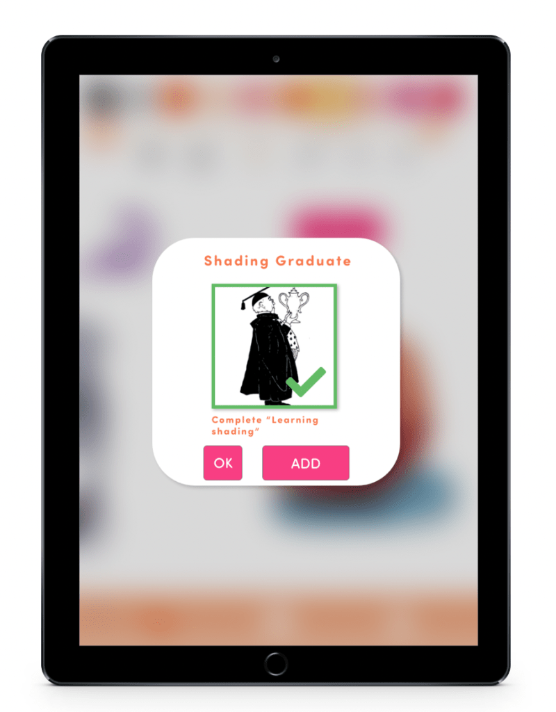

Upon completion of the doodle activity, Jacquelin receives a trophy. She can check her list of locked or unlocked trophies later in the home page. But right now, she wouldn’t mind having one last thing to color in so she taps “ADD.”
Now, Jacquelin’s break is almost over.
She will now reflect on her progress using the app and she will reflect on her own emotional journey.
The trophy Jacquelin unlocked is itself a doodle that can be colored in, adding a sense of accomplishment that will be a part of her piece of art.
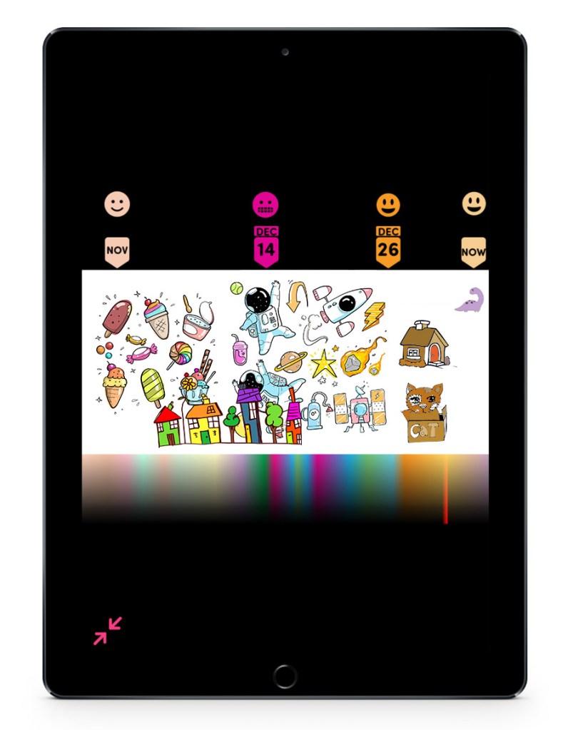
To see everything she’s done, Jacquelin can scroll horizontally through the content she’s done, she can zoom out to see more of the canvas, or she can tap the maximize view button in the top-left corner to see the entire canvas at once.
Once Jacquelin zooms out of the canvas completely, she can see new information to help her reflect. Markers indicate when she chose certain moods so she can get a better sense of what her emotions have been like. A color gradient at the bottom will show the dominant color of every point in the horizontal canvas, allowing Jacquelin to not just better understand her emotions, but how she perceives them through her color choices.
Future Development
Colour Journal would be developed as an iPod and iPad application. Additional testing would involve how the drawing UX would actually feel on these devices. The attention to detail in usability would be very important in determining how relaxing it feels to draw and color. Additionally, content would have to be created for activities, trophies, and prompts.
Colour Journal Summary
Unlike less casual art apps, Colour Journal does not have a layers panel. The ink tool is always on its own layer in front of the color layer so users can keep focused on quickly expressing themselves. These shareable “ink” drawings are specifically what we have been calling doodles.
The canvas is where all of the art is made or placed. Doodles drawn by other users, step-by-step activities, and even unlockable trophies earned are all brought in this one space to be colored. This cohesive experience allows users to create and organize their own colorful doodle collection, doodle town, or doodle world. As the user adds more content, the canvas expands horizontally.
Users can reflect on their experience with the app by using the playhead-like tracker on the top of the screen. Or the user can maximise the entire canvas. This will track what moods users were feeling at certain dates. A rainbow gradient condenses all of the user’s color information into a single image that is easy to digest.
This expanding canvas results in a unique, expressive, and personalized way to reflect on your emotions and your artistic progress while always having something to color. All without the standard point systems or basic calendars.
